OK, this is lovely. Remember Phil Jones of the CRU saying they had retained only “homogenized, value-added” data rather than raw measurements? It seems that well before the CRU leak there was strong circumstantial evidence that much (perhaps all) of the supposed global-warming signal is accounted for by “adjustments” made to the data.
Get a load of this graphic:
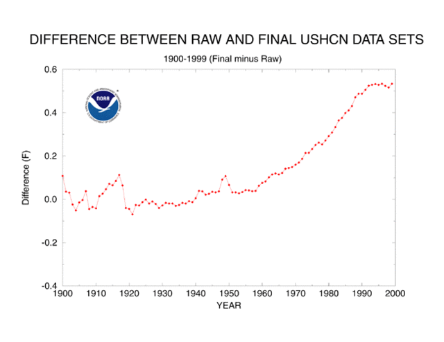
This is the NOAA (National Oceanic and Atmospheric Administration) telling us itself what the “adjustments” do to the U.S historical temperature record. If you look over at the scale on the left, you’ll see that these “adjustments” explain about 80% 50% of the supposed global-warming signal between 1900 and 2000.
Gee, does that shape look…familiar? Why, yes. Yes it does. The Climate Skeptic post I lifted this from reproduces my plot of the “VERY ARTIFICAL correction for decline!!”. It’s possible to make too much of the similarity, I think; the “decline” that VERY ARTIFICAL was “correcting” for was in tree-ring proxies for temperature, not measured ground temperature.
Still…isn’t it curious that every time we dig into the supposedly “value added, homogenized” data, we find a similar pattern of “adjustments” in that oh-so-familiar hockey-stick shape?
Why, it’s almost as if the people doing the “adjusting” imposed their preconceptions on the data, fixing it to conform to pet theories that just happen to be lucrative funding sources as well. But, no, that could never happen, could it?
UPDATE: Estimate of error changed from 80% to 50% because the scale is Fahrenheit. I waited to do this until I could get an AGW alarmist to commit to a specific correction, so I couldn’t be accused of shading the number to favor a skeptical position.