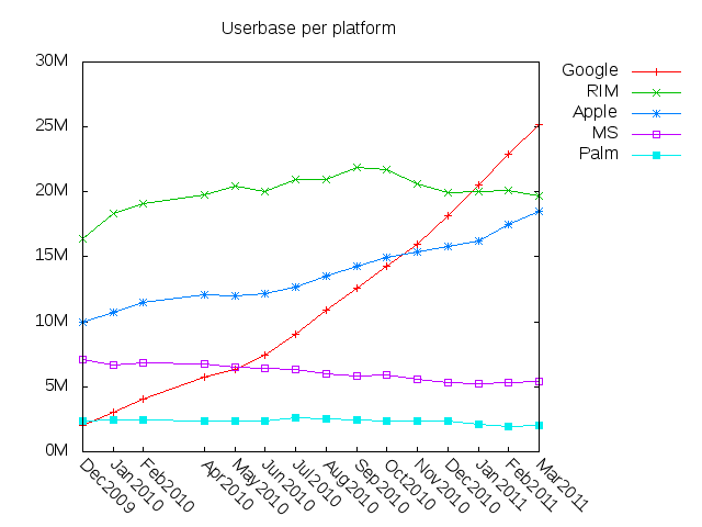
I’ve put together a tool to visualize the smartphone market-share data comScore makes available in its monthly press releases. Readers can download both the tool and the raw data in order to check my work. And the first new visualization is quite interesting:
This was derived in the obvious way; I simply multiplied the market-share percentages by comScore’s number for total smartphone users. The result provides a different perspective from the market-share visualization I posted yesterday. It is, I think, quite revealing.
We can see that Android is on a qualitatively different growth path than any of the other smartphone platforms. It’s not just that the slope is different, it’s that Android’s growth curve looks less perturbed by short-timescale events. This is probably a consequence of the breadth of the Android product range – market success or failure is a summation of more product bets, which will tend to average. I’m left wondering what happened in May 2010 when the slope increased.
Apple is the other platform that’s actually growing users. I think, bearing in mind that ComScore reports three-month running averages, that we can actually see the effects of the iPhone 4 and 4V here; there are small slope increases at about the right places in June 2010 and February 2011. Still, there’s not a lot of hope in this graph for anyone who wants to think Apple will catch up to Android.
I think this visualization increases the mystery around Apple’s market share trend being essentially flat for 18 months, because Apple has gained something like 5 million users in that time. I can’t believe it’s just a fantastic numerological coincidence of market conditions, but I don’t know what it means.
My has RIM been having a bumpy ride. This visualization makes its situation look less dire than I previously thought; evidently, RIM has been gaining users just a little faster than it’s been losing share. Still, the trend for them since September 2010 hasn’t been good. The visualization also shows how Android and Apple have been sucking the oxygen out of RIM’s atmosphere, and that’s unlikely to change anytime soon.
Microsoft’s decline is clearer here than in the market-share plot. What a helpless, screwed-up mess they look like these days! Looks like Linux is doing them in after all, except in smaller cases than we expected and with ARM chips.
Interestingly, Palm is in the position I thought six months ago RIM might occupy – declining share but a very stable userbase. Perhaps I’ve underestimated their survival odds.